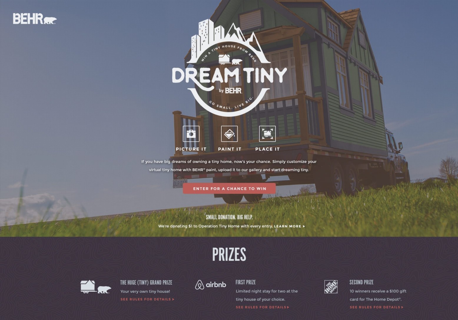
That was the brief — and the challenge — behind Behr Dream Tiny, a project launched by Behr Paint Company in 2016. At its core was a real, fully equipped tiny house, painted with Behr’s premium Marquee Exterior Paint & Primer, set to travel across the United States. But our task wasn’t to design the house. It was to design the imaginative system around it — a digital space where users could customise their own dream tiny home, explore landscapes, and step into a story that felt entirely theirs.
As the product designer, I led the interface design, interaction model, and overall visual direction. But I also work on the content architecture and narrative voice, ensuring the UI and storytelling worked in unison.
We began with structure. The experience unfolded in three phases:
Imagine it. Paint it. Place it.
Each one designed to mirror the physical process of creating a home, reinterpreted as a digital ritual.
The first step was establishing tone and mood. Not just visually, but across every touchpoint — text, motion, interaction. The product had to feel exploratory, open, and emotionally resonant. We stripped the interface of unnecessary friction. Navigation became invisible. The canvas came first. Actions emerged only when needed. Everything was timed to the pace of curiosity.
For the paint selection phase, we built a dynamic palette interface — inspired by swatch books and physical tools. Users could drag colours, preview instantly on their tiny house, and mix combinations in real time. Animations were soft and responsive. The colours didn’t just appear — they settled. We made texture visible but not literal. The feeling was tactile, not technical.

Meanwhile, we developed content hooks that grounded the visual flow in meaning. Each colour family came with short emotional prompts — “sun-warmed”, “coastal stillness”, “desert dusk” — tying shades to moods. These lines weren’t marketing copy; they were small, sensory anchors. I collaborated closely with the writer to ensure that the language matched the pace of interaction — never too loud, never too abstract. Just present.
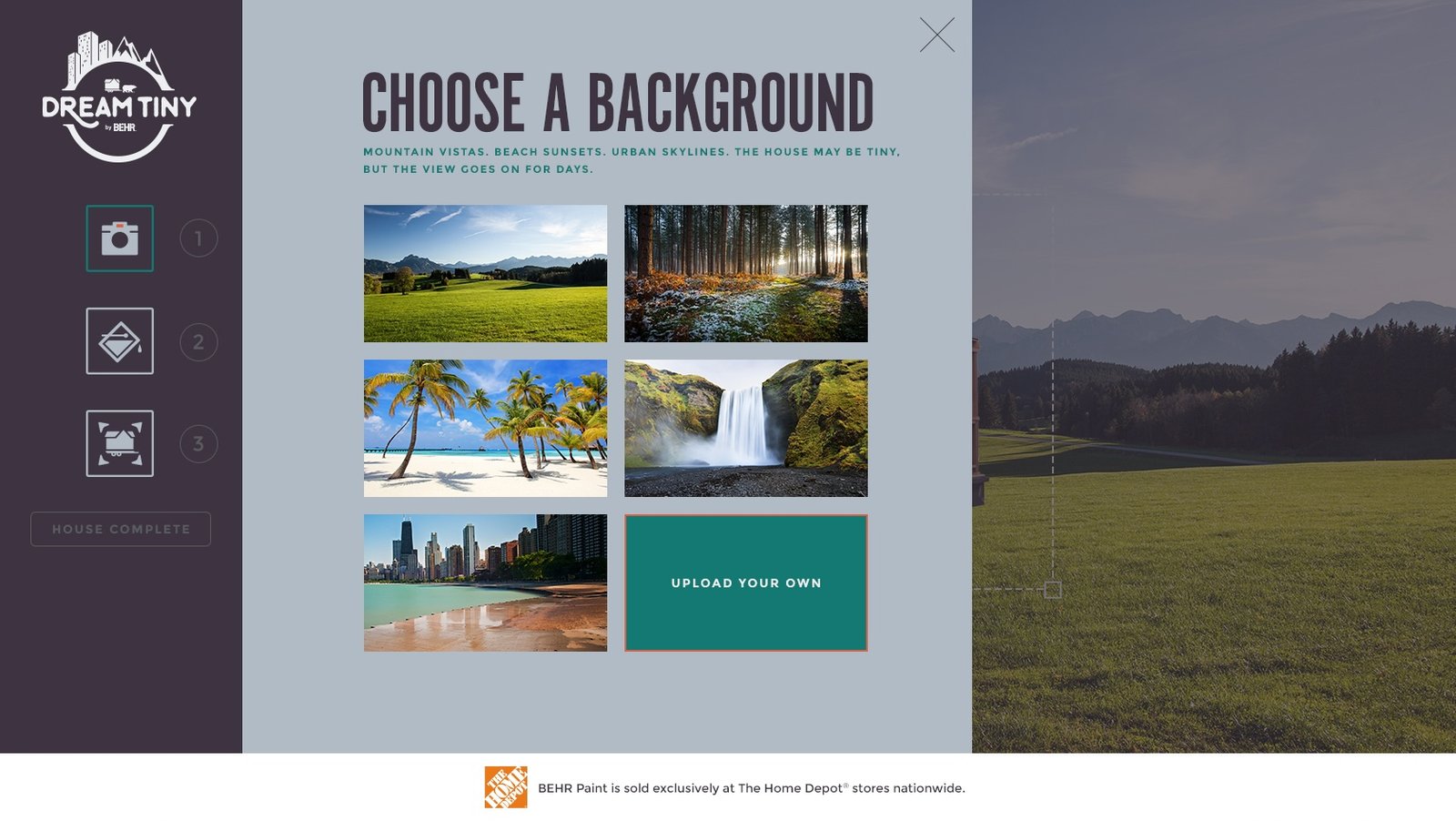
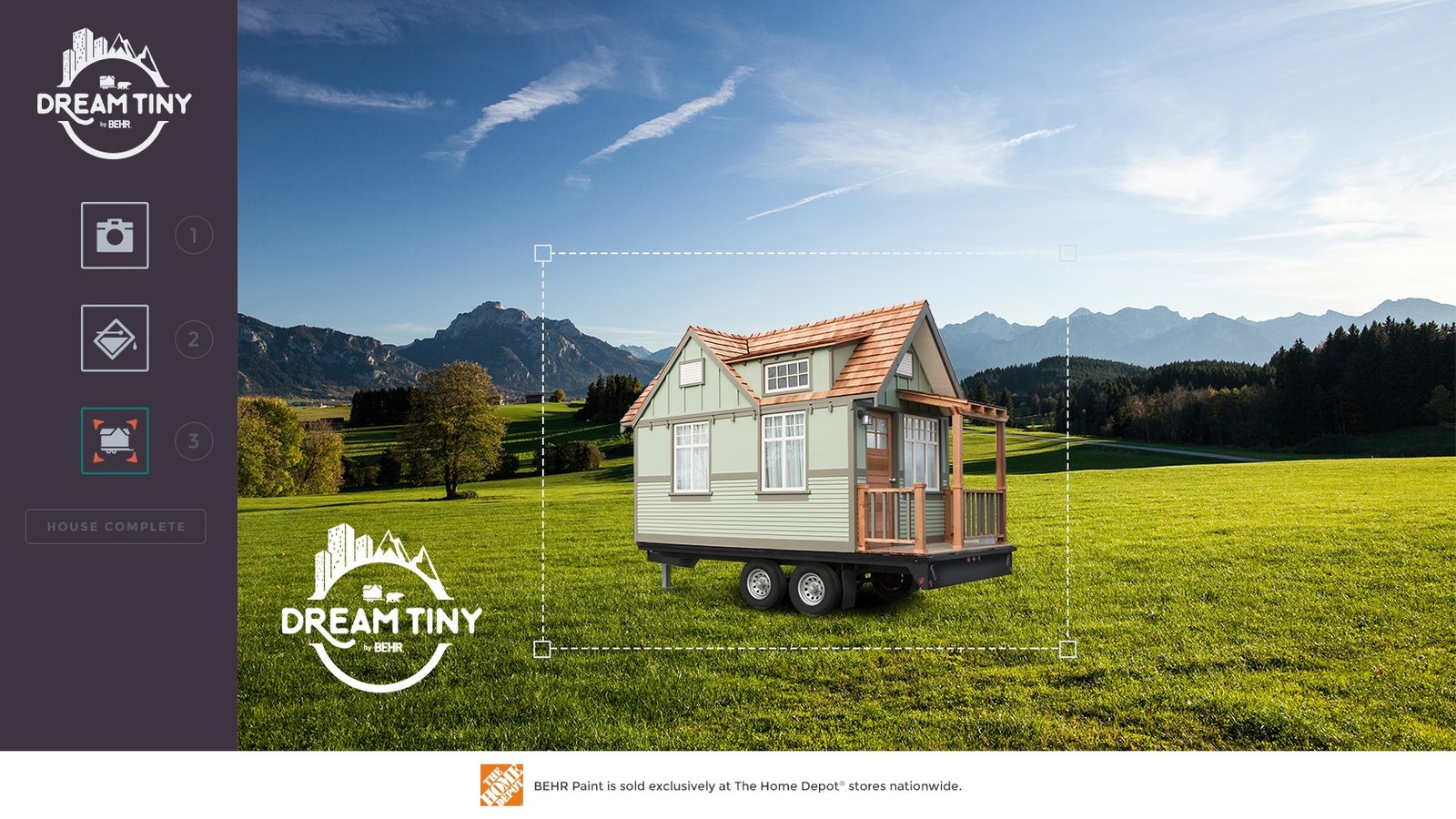
In the landscape phase, we designed cinematic backdrops — forests, deserts, mountain passes — layered with gentle motion. Clouds moved. Leaves shifted. We introduced drag-and-place interaction so users could set their home within the scene, adjust scale and angle, and watch it nestle into the environment. The UI responded without judgment. Every placement was valid. Every view, intentional.

One of the most intimate parts of the experience was the “Tell Your Story” screen. We didn’t want to ask for a form. We wanted to offer space. Working with the content lead, we built a guided text interface with light prompts and poetic cues — phrases floating softly beside the text field, like the start of a journal entry. A desert sunrise. A coffee mug on a windowsill. A crack in the paint that meant something. The goal wasn’t to write the user’s story — it was to unlock it.
From a design perspective, this meant calm type hierarchies, auto-expanding text fields, and a full-bleed background that changed tone with each phase. From a content perspective, we trimmed word limits, balanced inspiration with openness, and avoided cliché. Every line was workshopped together — not in isolation, but inside the flow.

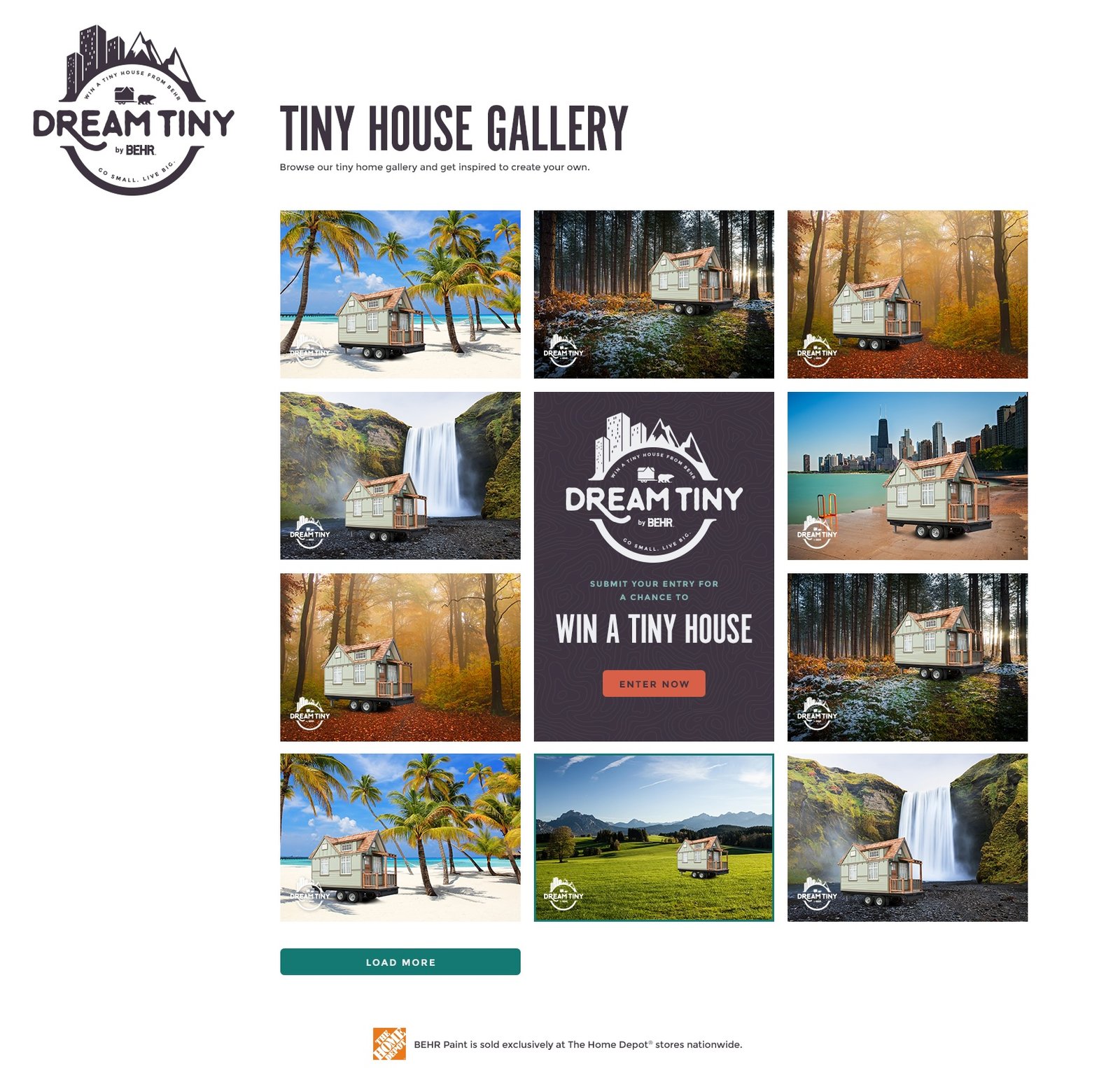
The gallery section became our living archive — a collective expression of imagination. We designed it as a responsive grid with gentle hover states and expandable cards. Each house appeared as a small, complete world — colour, setting, and story intact. Clicking into one opened a mini-experience: no ratings, no noise. Just someone else’s version of home.
Even the thank-you screen was treated as a final gesture, not an exit. A warm gradient. A soft scroll. The user’s tiny home in motion. A final line of copy we treated like the close of a short story — neither pitch nor summary, but something that let the feeling linger.

Behind the surface was a robust, flexible design system. Components were built to be light, mobile-first, and easy to adapt across breakpoints. We used CSS-based animation to avoid performance strain. Every visual enhancement — from drop shadows to transitions — was intentional. Nothing existed just to look good. Everything existed to feel right.
The results followed. Over 28,000 people submitted their tiny house. The conversion rate surpassed 25%. Interaction time exceeded expectations, and more than 3 million users were reached. The campaign won Gold Honour at the 2017 Shorty Awards. But the success wasn’t measured in numbers alone.
Users told us they felt inspired. That they imagined their real home differently. That they paused. That they stayed. One wrote, “It felt like a moment away from the rest of the internet.”
That, for me, is the benchmark — not functionality alone, but presence. Not just clarity, but emotion delivered through design.
Working on Dream Tiny showed me how product design and narrative content can blur — how microcopy becomes UI, and interaction becomes part of a story. It taught me that when the interface respects imagination, the user fills it with their own meaning.
You don’t often get to design a digital home for something that moves.
When you do, you design it like it’s real — because for a few minutes, it is.
