The original website was functional. It listed facts, published recipes, explained ripeness. But it didn’t capture the freshness, the optimism, the generosity of what California Avocado stood for. So we started again — from the first click to the last scroll.
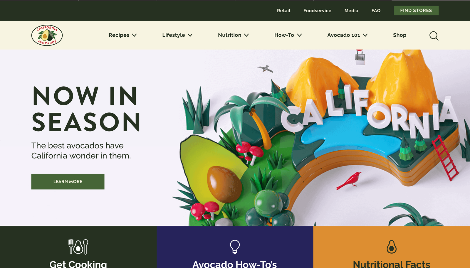
For six months, I worked side by side with their internal team, leading the visual redesign and interface strategy. My goal wasn’t to modernise for the sake of trend. It was to shape a user experience that reflected the product’s real-life appeal — bright, clean, and full of possibilities.
The first thing we tackled was the structure. The old layout was built for information, not exploration. Pages felt flat. Hierarchies were unclear. Users often didn’t know where to go next. So I mapped a new architecture based on user flows rather than business categories. Recipe discovery became a journey, not a list. The “How to” section — often one of the most visited — was moved closer to the homepage and integrated into the navigation as an active learning space, not a secondary FAQ.
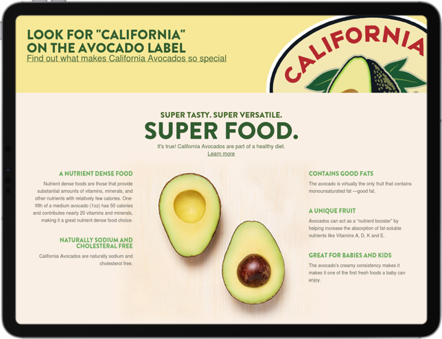
On the homepage, we introduced a modular layout with dynamic content blocks that could shift depending on seasonality or campaign. Every section was intentionally built to support scroll — anchored by vibrant, full-width photography and balanced by breathable white space. The visuals didn’t crowd the screen. They invited users in. A soft parallax effect gave the page subtle depth without distracting from usability.
Micro-interactions played a key role. A card expands on hover. A recipe fades in with a staggered animation. An avocado in the corner gently pulses to invite interaction. These details — small and unobtrusive — helped reinforce a tactile feel, echoing the physical nature of the product itself. The transitions were fast but soft. Nothing snapped. The site exhaled.
Filtering and discovery became a design priority. We redesigned the recipe index using multi-layer filters that allowed users to browse by meal type, occasion, preparation time, or dietary need — without feeling like they were using a database. The filters revealed context, not just categories. The UI used smart defaults to prevent dead-ends. Mobile interactions relied on swipe gestures and bottom-drawer filters, optimised for thumb use and low-friction browsing.
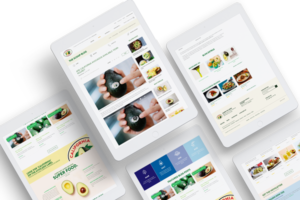
One of the biggest improvements came through visual hierarchy and type scaling. The previous design used a single font weight and treated all content equally. We introduced a typographic scale that guided attention: bold, editorial headlines; smaller, friendly body copy; metadata tucked away but visible when needed. The type system was responsive by design, adjusting for different breakpoints without sacrificing rhythm or clarity. Every line of text had room to breathe.
Accessibility was baked into every decision. Colour contrast met or exceeded WCAG 2.1 guidelines. Focus states were custom-styled. Iconography used consistent line weights and included descriptive text on all buttons. The UI could be navigated by keyboard without confusion. I tested the site using screen readers, ensuring the visual richness didn’t exclude users with different needs.
Mobile was never a version. It was a starting point. Over 70% of the site’s visitors came from handheld devices, so I treated small screens as primary. The mobile experience was rebuilt around thumb ergonomics — bottom-anchored menus, swipeable cards, larger touch targets, and collapsible content sections to reduce cognitive load. The recipe pages became scrollable stories, complete with inline tips, save buttons, and image galleries that adapted fluidly to screen size.
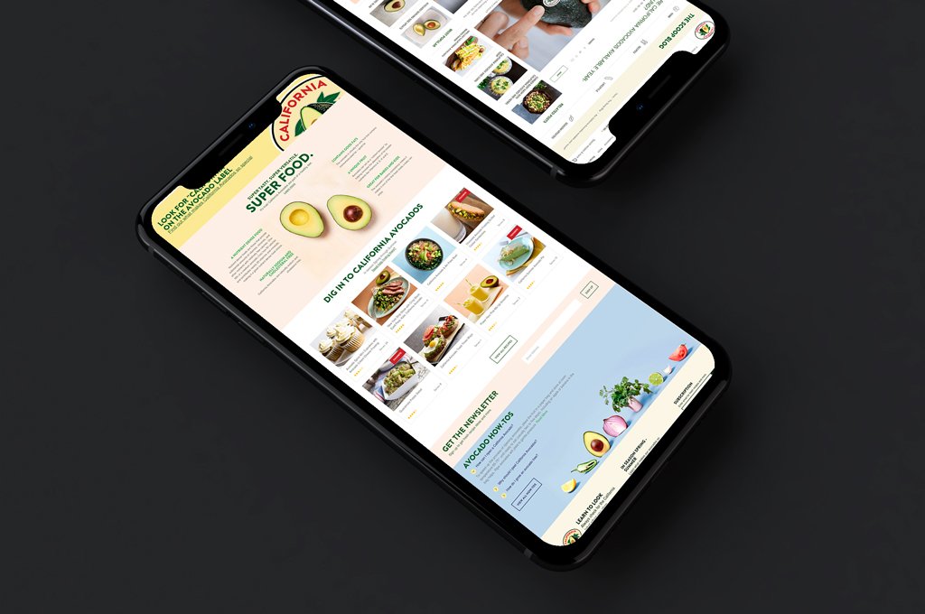
We didn’t use templates. Every layout was component-based and responsive, but customised per section. The “Ripe Now” indicator, for example, was designed as a living UI element — pulsing gently when the season was right, dimmed when it wasn’t. It created a moment of delight without relying on gimmick.
Behind the surface, I worked closely with the development team to ensure performance didn’t suffer under the weight of the visual upgrades. We opted for lightweight SVG icons, modern image formats, and scroll-triggered loading for richer elements. Lazy-loading modules kept pages fast. We maintained design fidelity across breakpoints without overcomplicating the DOM.
Feedback was immediate. After launch, the average time on site rose sharply. More importantly, users interacted more deeply — exploring sections that had previously been buried, saving recipes, and returning regularly. The redesign didn’t just retain visitors — it slowed them down, in the best possible way. People stayed longer because they wanted to. The interface gave them reasons to linger.
Working on California Avocado reminded me that interface design is emotional. You’re not arranging boxes on a page — you’re shaping an atmosphere. You’re making a promise, and then delivering on it. For a product like this — healthy, natural, tactile — the UI had to feel the same. It had to move like the product tasted: smooth, fresh, quietly delightful.

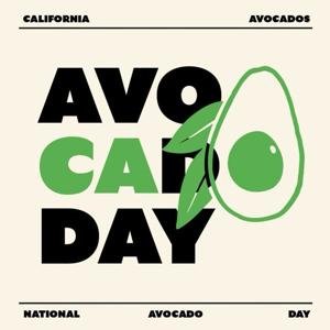
The result wasn’t just a better website. It was a digital experience that respected its audience. It spoke their language, matched their pace, and mirrored their lifestyle — not through slogans or sales tactics, but through interaction, visual care, and flow.
We didn’t sell avocados. We designed the feeling of wanting one.
