That message marked the beginning of a collaboration that lasted over two years. What began as a content-led question quickly evolved into a full redesign of the product experience. At its core, the work was about trust — not just earning it, but designing for it.
Brokers Online wanted to become a platform that helped people understand how to invest, compare their options, and take their first steps — without being overwhelmed or pushed into decisions. But early tests revealed that something wasn’t working. Despite having solid information and tools, the experience still made users feel uncertain. The interface was flat. The guidance was generic. The decision-making journey — especially for beginners — was too fragile.
So we paused.
Before anything was redesigned, we needed to understand how users approached investing — emotionally, cognitively, behaviourally. We conducted qualitative interviews with users across three experience levels: absolute beginners, cautious intermediates, and self-taught hobbyists. The most common pattern wasn’t lack of information. It was fear. Fear of losing money. Fear of trusting the wrong platform. Fear of starting “too late” or “too small.”
We built personas not around demographics, but around emotional states: the skeptical researcher, the anxious beginner, the quietly curious. Alongside this, we ran journey mapping sessions to uncover friction — from discovery, through comparison, to onboarding. It became clear that the product wasn’t failing in functionality, but in pacing. It gave users too much too early. Or worse: it asked for decisions before users had a framework to decide.
So we focused on reducing cognitive load and decision fatigue.
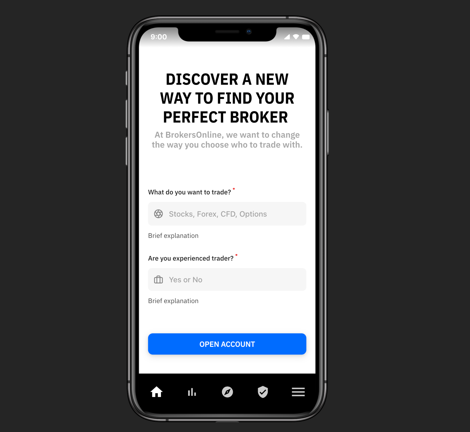
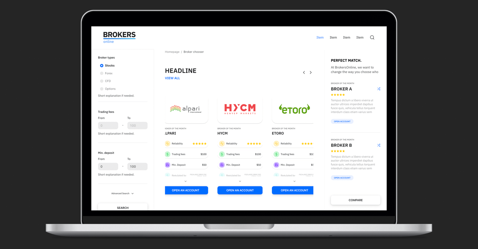
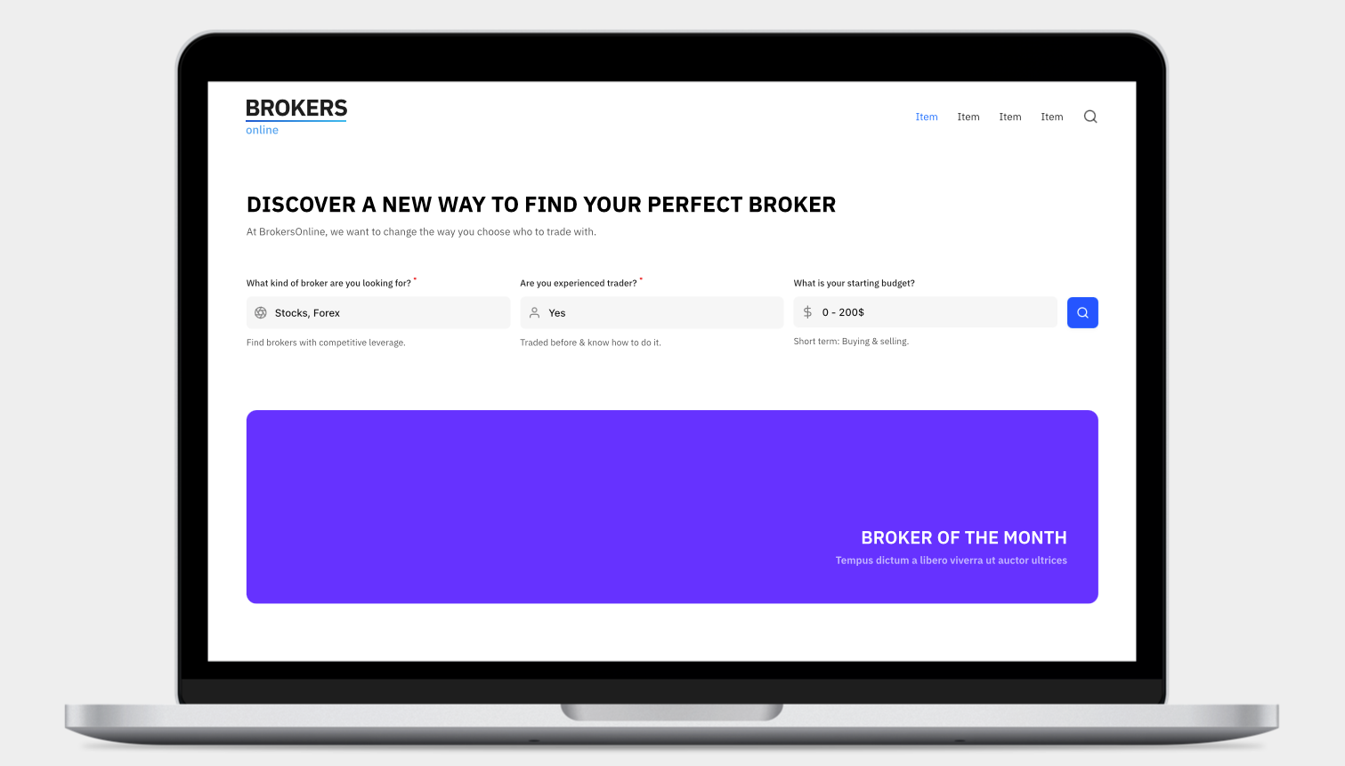
The first major change was to the comparison experience. Previously, the broker comparison table read like a spreadsheet — efficient, but cold. We redesigned it as a guided flow, starting with a lightweight quiz that captured a user’s budget, experience level, and investment priorities (e.g. low fees, mobile access, or educational resources). Based on those answers, users were presented with a curated shortlist, written in human terms, not financial jargon.

We prototyped multiple versions: vertical cards, split-view comparisons, matrix tables. Through iterative testing with real users, we found that simplicity always won. The most successful layout used visual iconography, bite-sized feature highlights, and a consistent structure. We added an expandable layer to let more advanced users dive into specifics — but made sure the default view felt like a conversation, not a report.
At the same time, we reworked first-time user flows. A significant number of users landed on the platform without a clear goal. They were exploring. So we built a lightweight onboarding tool that asked one simple question: “What’s your biggest concern about investing?” Depending on the selection, the UI adapted — offering articles, tooltips, and examples tailored to that concern.

We also worked on information architecture and language clarity. Much of the platform’s original language was accurate, but distancing. Terms like “financial instrument” and “liquidity” weren’t necessarily wrong — but they belonged to a different context. We conducted language testing using card sorting and comprehension tasks, observing which terms confused users and which made them feel confident. The new microcopy was shorter, warmer, and always goal-oriented.
Trust wasn’t just a matter of content — it was also a matter of system feedback and flow logic. We simplified navigation paths and reduced the number of steps to reach a result. We made forms conversational. We revised button copy. And we made space for silence — removing unnecessary pop-ups, consolidating notifications, and rethinking the page rhythm so users could pause, think, return.
Throughout the process, we facilitated collaborative design workshops with stakeholders from product, support, and compliance. Financial products are tightly regulated, and many of our design decisions had to balance clarity with legal accuracy. These sessions weren’t always easy — but they helped us align around a shared principle: if users don’t understand it, they won’t trust it.
The impact of these changes was visible within months. Completion rates on the broker selection tool increased by over 40%. Navigation time dropped. Session duration grew, especially among first-time users. But what mattered most were the unsolicited comments:
“I had no idea how to invest and was afraid of losing my money. After using this site, I opened my first account with a broker. It wasn’t just information — it was clarity.”
What this project reinforced for me is that product design — especially in high-friction domains like finance — is about empathy first. Not sympathy, not persuasion, but a deep respect for the uncertainty users carry. Our role as designers and researchers isn’t to simplify the subject. It’s to guide people through its complexity without making them feel lost.

Brokers Online didn’t become easier by removing substance. It became more accessible by being more intentional. The product now mirrors what investing should feel like at its best: transparent, informed, and fully within reach.
And that’s what we designed — not just a comparison tool or an onboarding flow, but an experience that lets people make decisions with clarity, not fear.
